What is a Landing Page?
A landing page is a website page with a specific purpose — the objective of a landing page is to convert visitors into leads.
If you’re running paid media campaigns or marketing campaigns requiring a landing page, your landing page plays a crucial role in convincing visitors to convert.
Whether you’re aiming for more sales or leads, having high-quality landing pages is essential for optimising conversion rates and lowering conversion costs. In this article, we will explore the key elements of an optimised landing page for ads and provide you with valuable tips to create effective and relevant landing pages.
How to create a landing page?
Creating a landing page doesn’t have to be complicated. Here are some actionable, step-by-step instructions to help you create one.
Define your landing page goal & audience
Before you begin creating your landing page, it’s important to clarify your “why,” “who,” and “what.” Why are you creating this landing page? Who is your target audience for the landing page? What actions do you want your landing page visitors to take in order to help you achieve your goal?
Choose your landing page builder
After you define your goal for your landing page – your ready to jump to the next step in choosing the right landing page builder for the task at hand.
Landing page creation can be facilitated through different platforms, whether its your existing CMS (i.e WordPress, Wix, Squarespace) or you can look at levergaing a dedicated landing page builder such as; Unbounce, Lead pages or Hubspot.
These dedicated landing page building platforms will often come with pre-created landing page designs, reducing the requirement in having to engage with a professional designer to create the visual design for your page.
However, Builders such as Unbounce or Leadpages come at a cost… so if you are looking to keep the investment low… consider either Hubspots Free landing page builder or include it in your current website building platform.
Landing page design - Make it engaging!
A solid landing page needs to be engaging!
Make sure it matches your brand – This includes, colours, fonts, visuals (imagery) & potentially layout similarities.
One common mistake in landing page designs is overlooking the importance of high-quality imagery… Use product imagery or service imagery (depending on the product you are selling), team photos or business images & use video if you have available.
Use visuals to tell the story, pictures speak a thousand words, so try to include these where you can and it makes sense.
Messaging, Tone & Story
Potential customers respond to content that taps into emotion. Incorporate emotional words and phrases that resonate with your target audience.
For example, words like “imagine,” “discover,” or “transform” can help create an emotional connection.
Add your call-to-action (CTA)
Landing pages are tailored towards a goal… this goal is your CTA or call to action.
Whether this is a contact form, click to call, email or value proposition in a downloadable piece of content… make sure your CTA is visible and clear within your design and messaging to make sure your audience understands the next steps.
The Ultimate High-Converting Landing Page Checklist
A step-by-step guide to building pages that turn visitors into leads.
Phase 1: Strategy & Alignment
Before you design a single pixel, you must define the strategy.
- Define ONE Specific Conversion Goal A landing page should never have competing goals. Decide on the single action you want the user to take.
- Examples: “Download the eBook” OR “Book a Consultation.” Never both.
- Ensure “Message Match” The headline on your landing page must match the ad or email the visitor just clicked. If your ad says “50% Off Web Design,” your landing page headline must immediately confirm that offer.
- Why: Disconnects here cause high bounce rates.
- Define Your Target Audience Who is this specific page for? The copy and imagery should speak directly to one specific persona, not a general audience.
Phase 2: Above the Fold (The Hero Section)
This is the screen users see before scrolling. It must hook them instantly.
- Benefit-Driven Main Headline Don’t just describe what you do; describe the result.
- Bad: “We offer SEO services.”
- Good: “Double Your Organic Traffic in 90 Days.”
- Supporting Sub-Headline Use this to clarify the “How.” If the headline is the hook, the sub-headline is the explanation. It should support the main promise and encourage them to read on.
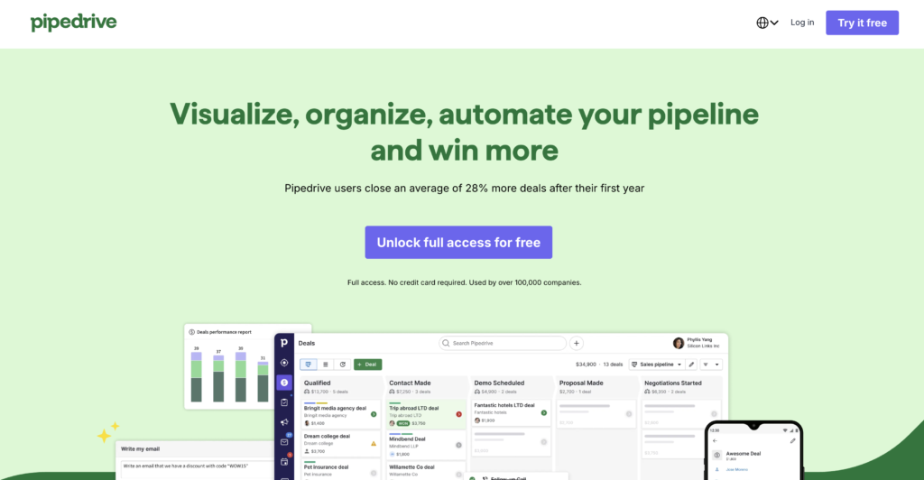
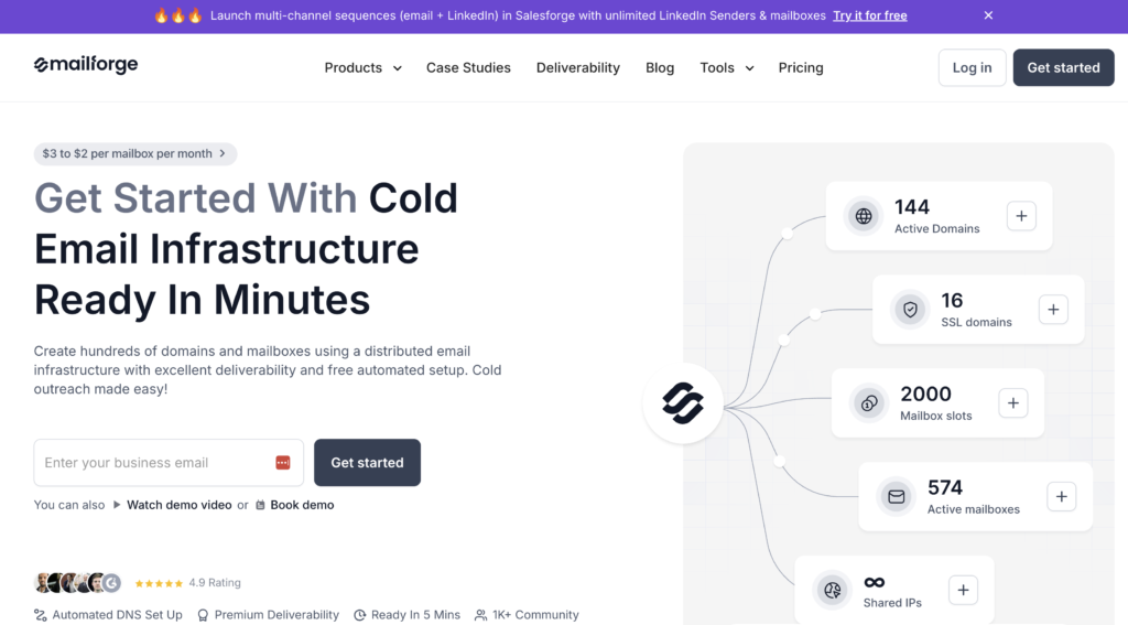
- High-Quality Hero Media Use a high-resolution image or video that shows your product in use or visualises the result of your service. Avoid generic stock photos of people shaking hands.
- Primary Call-to-Action (CTA) Your main button must be visible without scrolling. Use action-oriented text.
- Avoid: “Submit”
- Use: “Get My Free Quote” or “Start My Trial”

Phase 3: Content & Persuasion
Now that you have their attention, you must build desire.
- Focus on Benefits, Not Features Features are what your product has (e.g., “Titanium alloy frame”). Benefits are what your product does for the user (e.g., “Lightweight so you can run faster”).
- Use Bullet Points for Skimmability Online readers scan; they don’t read. Break heavy paragraphs into punchy bullet points to highlight key takeaways.
- The “How It Works” Section Remove the fear of the unknown. Show a simple 3-step process of what happens after they click the button.
- Example: 1. Fill out the form. 2. We analyse your site. 3. You get a custom plan.
- Address Pain Points Explicitly mention the problems your audience is facing to show empathy. Then, position your offer as the solution.
Phase 4: Trust & Authority
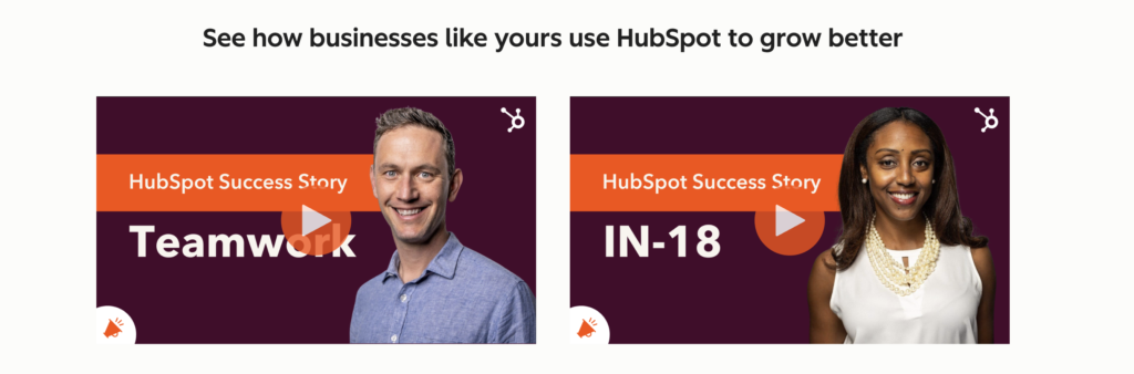
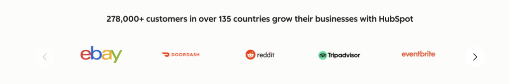
People buy from those they trust. Prove you are legitimate – Hubspot Landing page does this we’ll and ill use the examples below;
- Real Customer Testimonials Include reviews from actual clients. If possible, include their full name and a photo to increase authenticity.
- Trust Badges & Logos Display logos of well-known clients you’ve worked with, software you integrate with, or security badges (like “SSL Secure”).
- Risk Reversal (Guarantees) Lower the barrier to entry. Offer a money-back guarantee, a free trial, or explicit “No credit card required” text.

Phase 5: Design & User Experience (UX)
Good design guides the eye toward the conversion.
- Directional Cues Use visual cues (arrows, lines, or a person’s eye gaze in a photo) to point directly toward your Call to Action button.
- Contrast for CTA Buttons Your button color should not blend in. It should be a contrasting color that stands out from the rest of the page (the “squint test”).
- Mobile Responsiveness Check your page on a real mobile device. Ensure text is legible, buttons are large enough to tap with a thumb, and images stack correctly.
- Remove Global Navigation Crucial: Remove the header menu (Home, About, Contact). You don’t want users clicking away to read your blog. The only way off the page should be the CTA or closing the tab.